A New Take on Branding
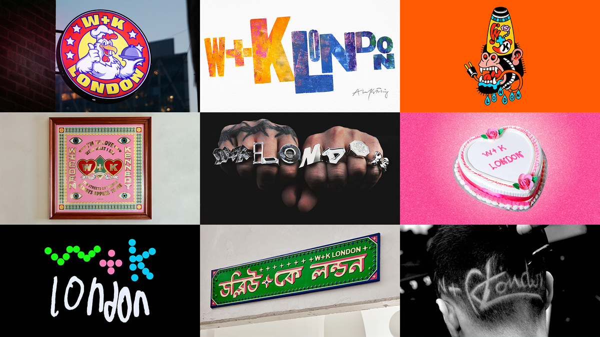
A logo is often perceived as a constant—a steadfast representation of a brand's identity. However, for a creative agency like Wieden+Kennedy, embracing diversity in their branding makes perfect sense. Instead of a single logo, they are experimenting with multiple logos that evolve continuously to reflect their eclectic influences and talents.
The Creative Process
Wieden+Kennedy London has engaged nine local artists and makers to reinterpret their logo. This initiative showcases a variety of mediums and aesthetics, from jewelry to culinary art, emphasizing the agency's commitment to creativity and innovation. The project is designed to be ever-changing, providing fresh perspectives on the agency's identity.
 (Image credit: Wieden+Kennedy London)
Featured Collaborations
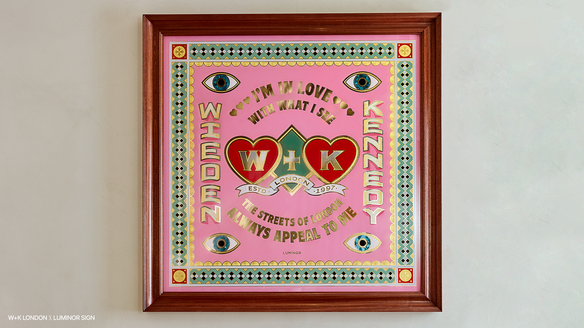
- Luminor Sign created a stunning 1m x 1m framed gold leaf glass panel for a meeting room.
- Joe Bazalgette Zanetti crafted rings that spell out the agency's name across the wearer's knuckles.
 (Image credit: Wieden+Kennedy London)
This dynamic approach not only showcases the creativity of the artists involved but also positions Wieden+Kennedy as a forward-thinking agency that values artistic expression as a core aspect of its brand identity.


Comments
Join Our Community
Create an account to share your thoughts, engage with others, and be part of our growing community.