HBO Max Becomes Just Max
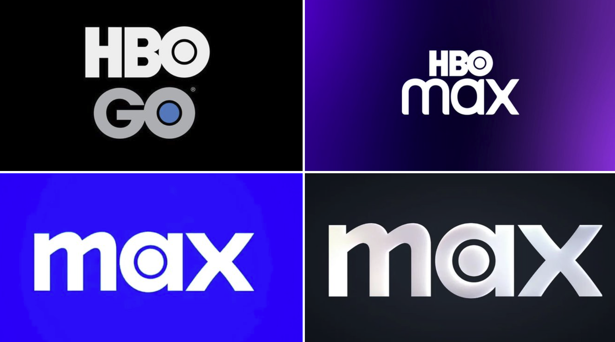
Warner Bros Discovery's streaming platform has officially dropped the HBO name in its rebranding to Max in 2023, leading to widespread confusion among viewers. Many have expressed their disappointment over losing the prestige associated with the HBO brand, while others have poked fun at the new tagline, "The one to watch for HBO," which seems contradictory without the HBO name.
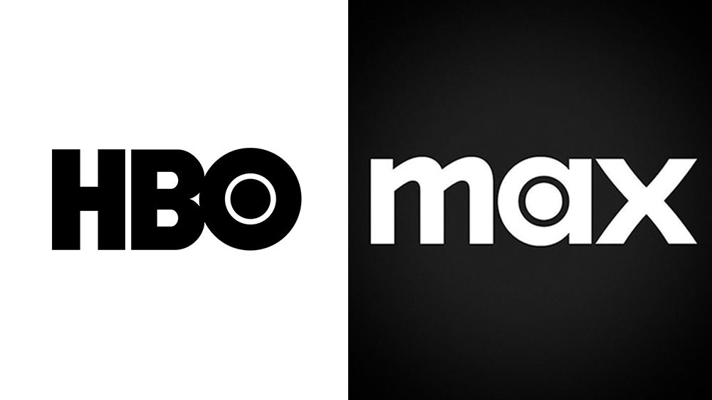
 The new monochrome Max branding (right) looks a lot like HBO's (left)
A New Look That Raises Eyebrows
The recent launch of a monochrome color palette—featuring white text on a black background—has further blurred the lines between Max and HBO. This design choice has sparked discussions about branding identity, with critics noting that the new look closely resembles the HBO logo. The first rule of effective logo design is that it should be unmistakably unique. As many are asking, does Max want to be associated with HBO or not?
Design Identity Crisis
The rebranding raises questions about brand identity and recognition. A logo should stand out and not be confused with others, and the new Max branding seems to challenge that principle.
Stay tuned for more updates from the world of design and branding!


Comments
Join Our Community
Sign up to share your thoughts, engage with others, and become part of our growing community.
No comments yet
Be the first to share your thoughts and start the conversation!