A Transformative Decade in Typography
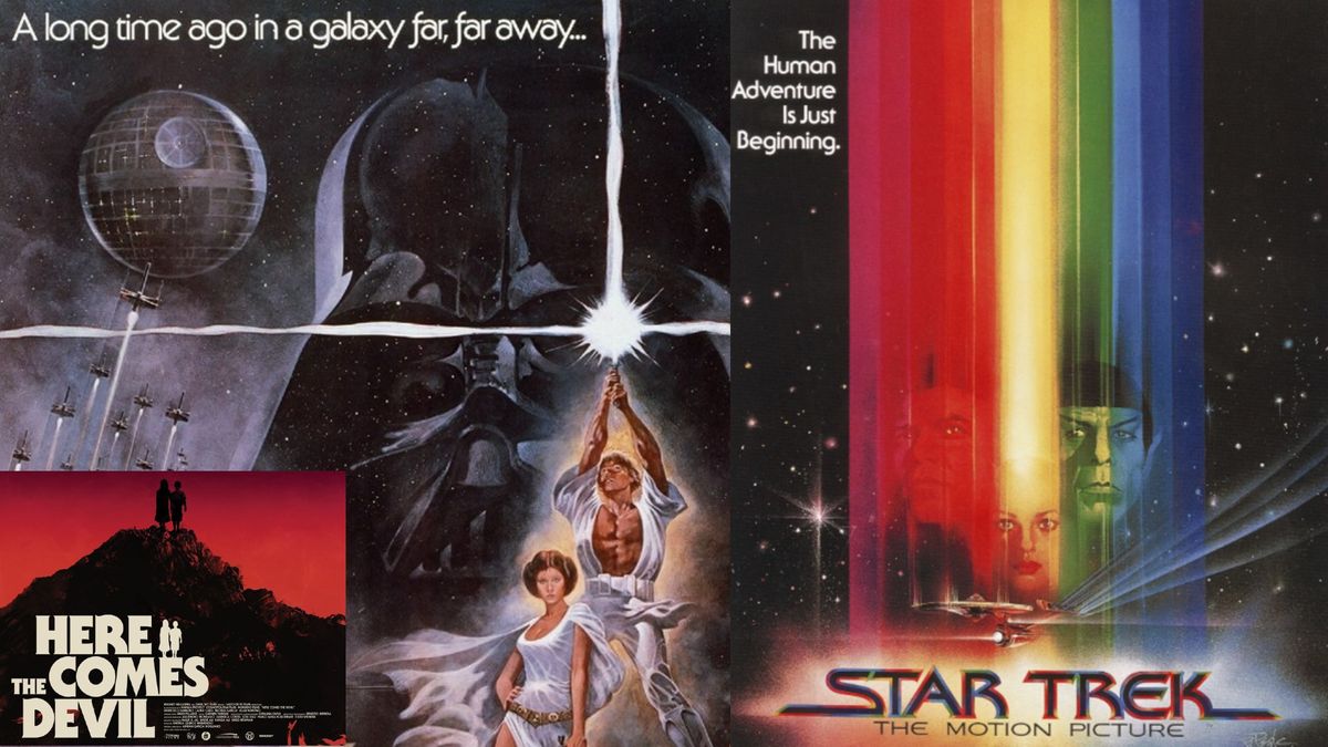
The 1970s marked a bold and transformative decade for design, and typography was no exception. As phototypesetting matured, designers found themselves liberated from the physical constraints of metal type. This evolution allowed letters to touch, overlap, and interact in entirely new ways.
Embracing the Spirit of the Times
Designers embraced the curves, flair, and experimental spirit of the time. This led to the rise of typography trends that included:
- Playful display fonts
- Chunky serif types
- Futuristic styles
These trends reflect the vibrant culture of the 1970s, characterized by a sense of freedom and creativity that revolutionized the visual landscape.

(Image credit: LucasFilm, Paramount Pictures, Dark Sky Films)
This exploration of typography during the 1970s not only highlights the aesthetic changes but also the cultural shifts that influenced design choices during this vibrant decade.
Tom May is an award-winning journalist and editor specializing in design, photography, and technology.


Comments
Join Our Community
Sign up to share your thoughts, engage with others, and become part of our growing community.
No comments yet
Be the first to share your thoughts and start the conversation!